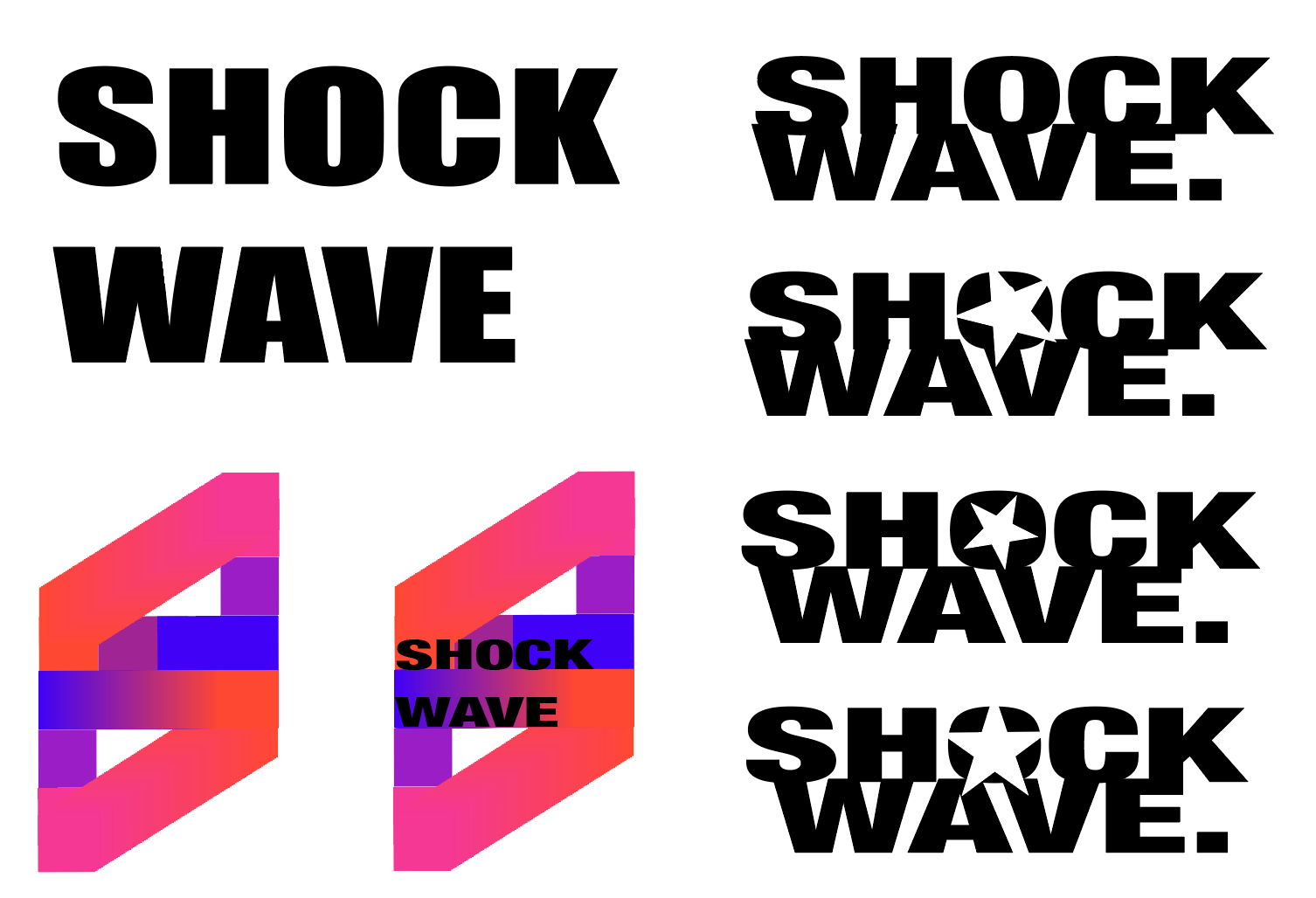
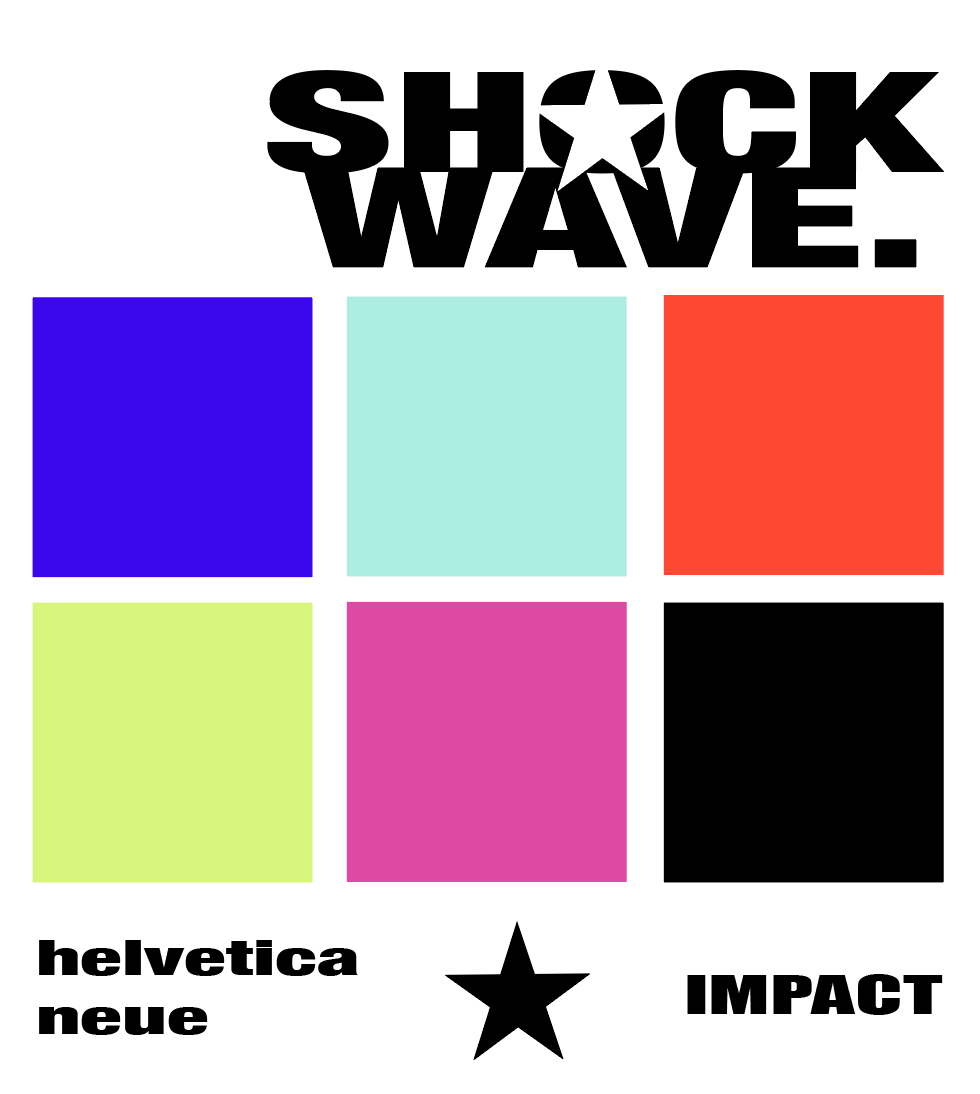
logo and identiTy
I wanted to create a logo that can stand alone, but also won't take away from the main focus of the posters and tickets. Using a strong typeface like Helvetica Neue, the logo feels more concrete and sturdy to contrast with the movement of the posters.
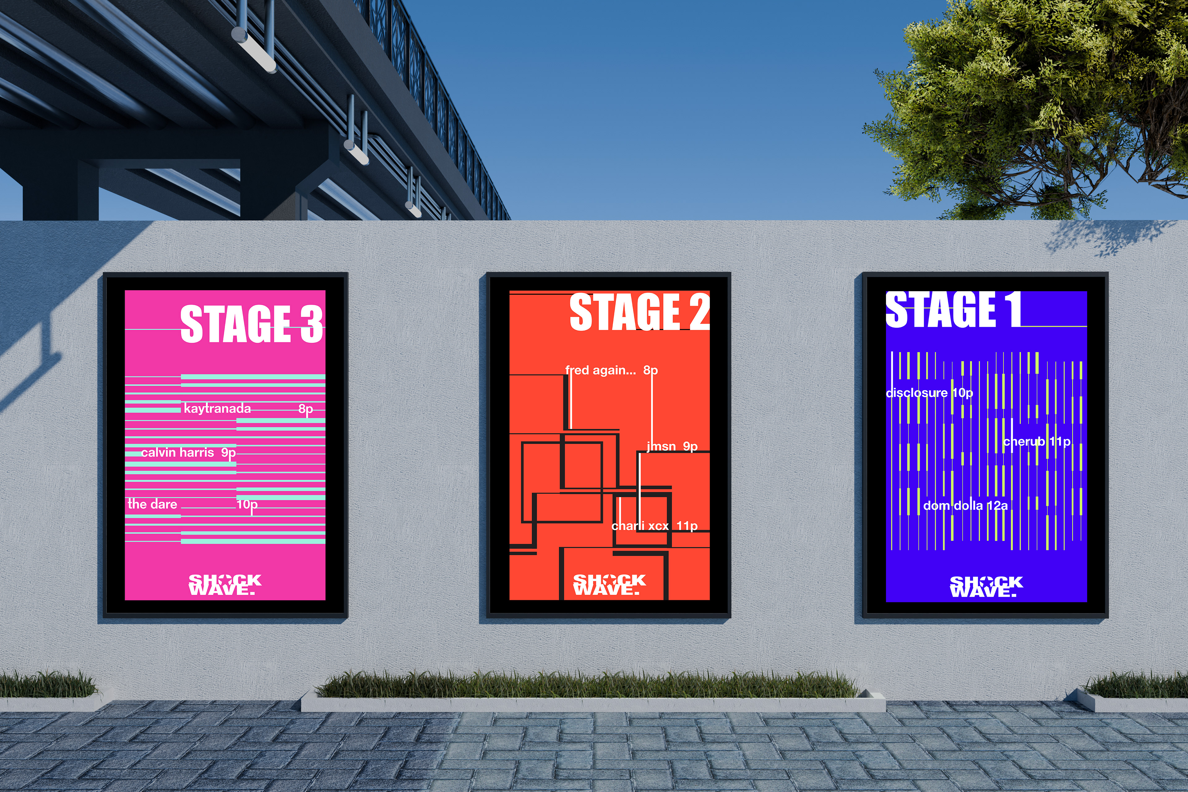
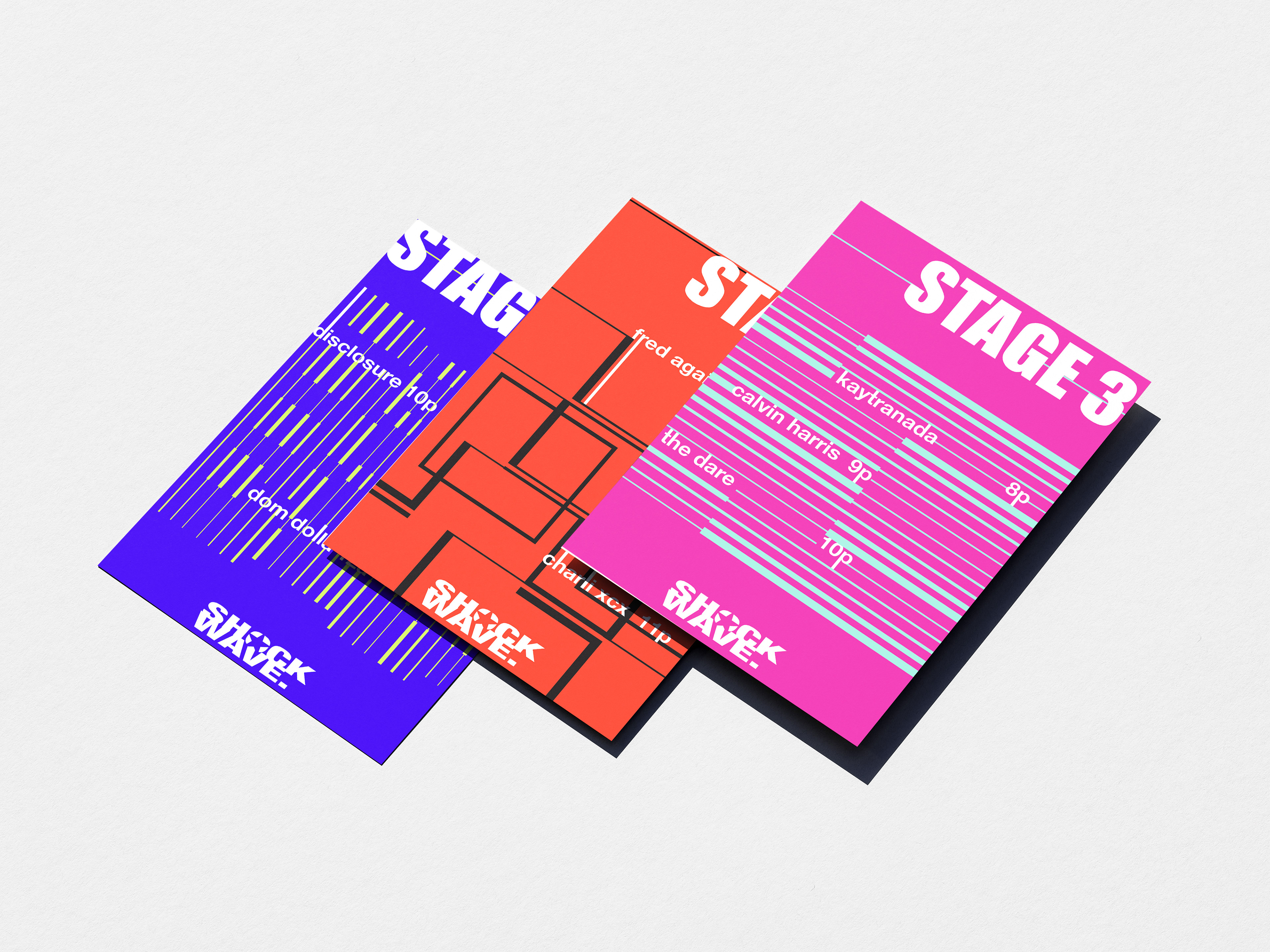
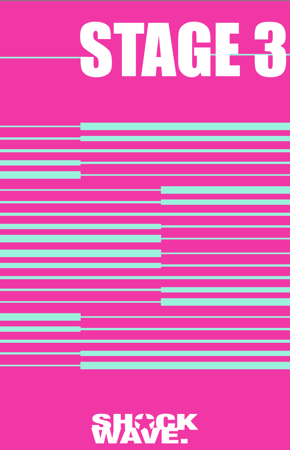
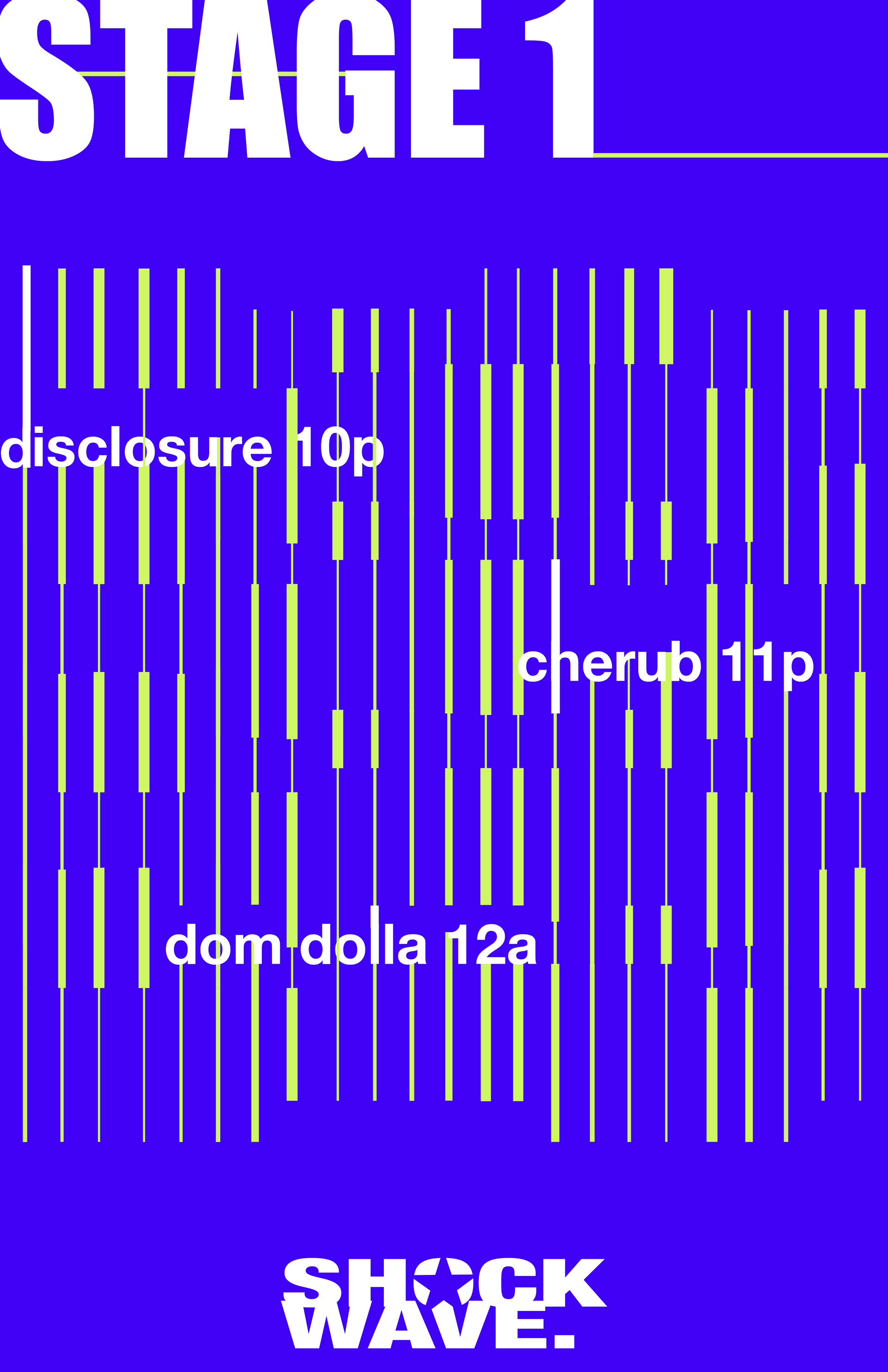
3 poster series iteration
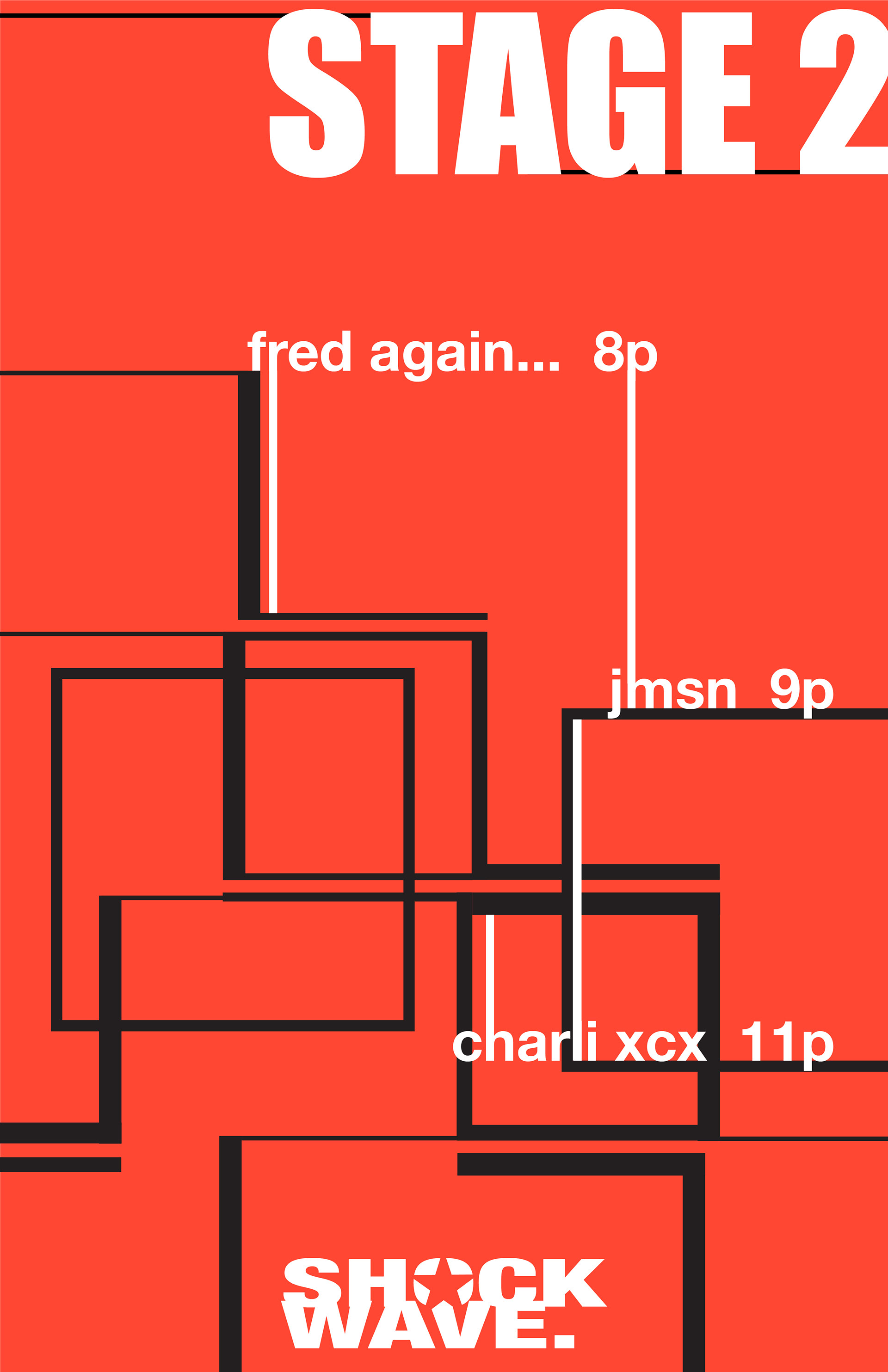
. The main idea of the series was to create a graphic way to portray sound using pattern, movement, and repetition to show abstract sound waves.
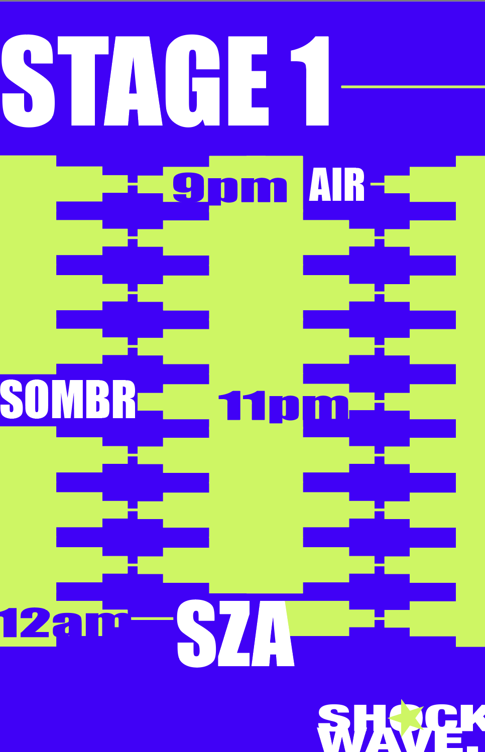
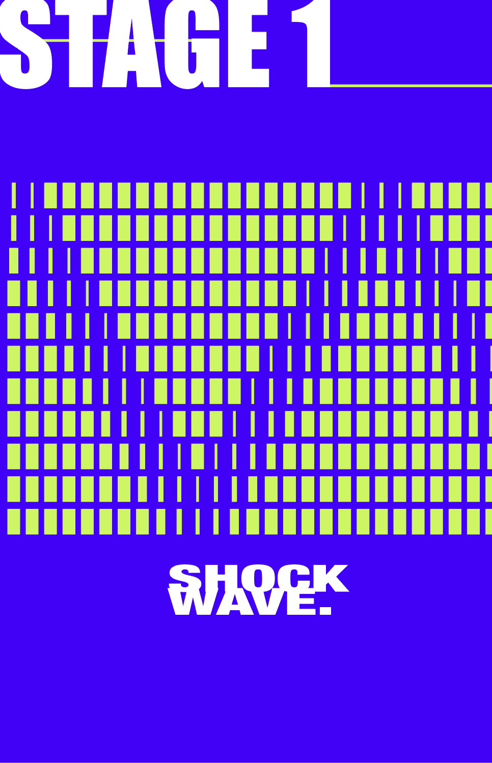
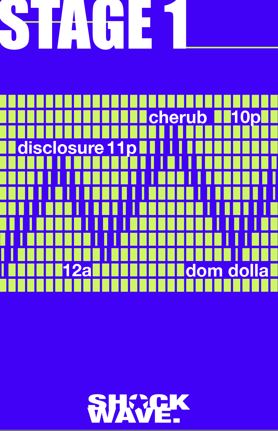

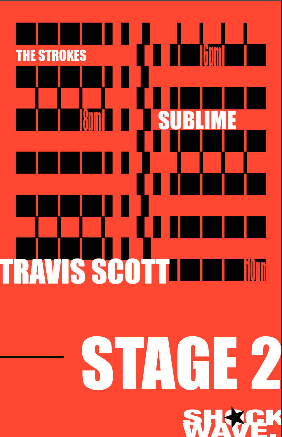
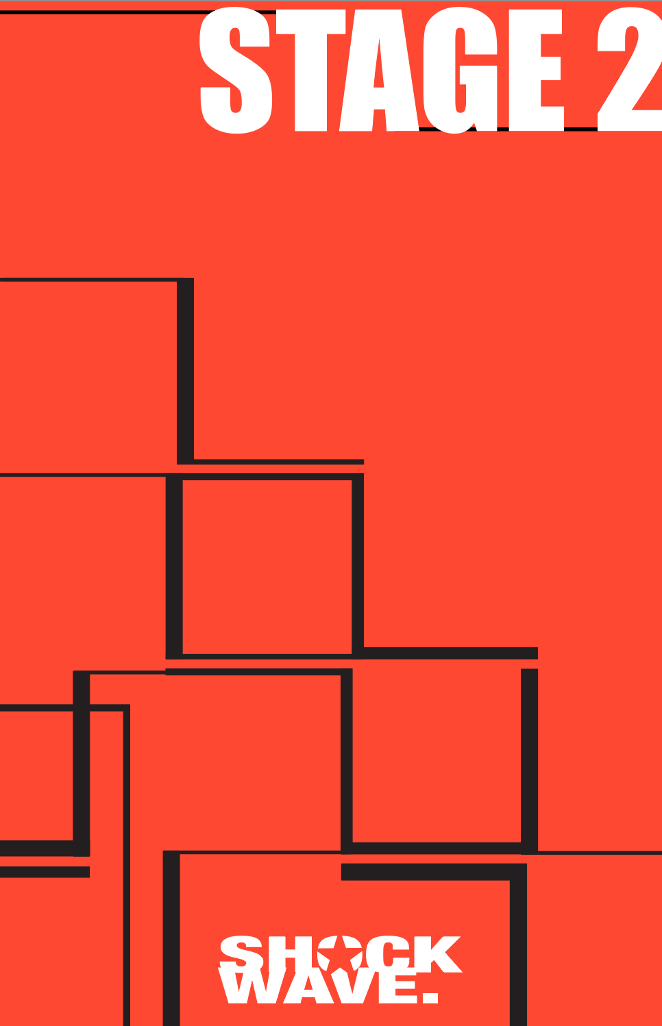
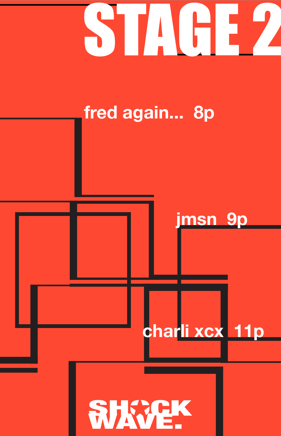

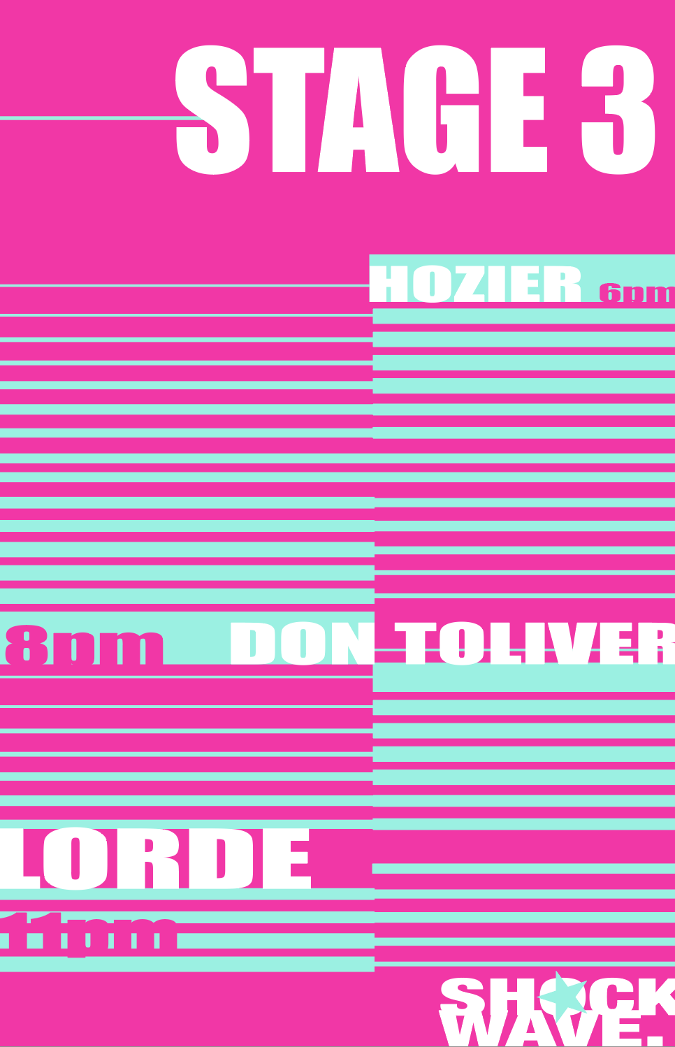
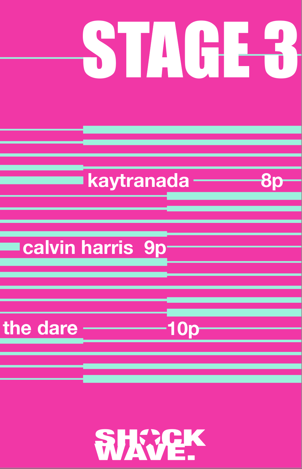

Final poster designs

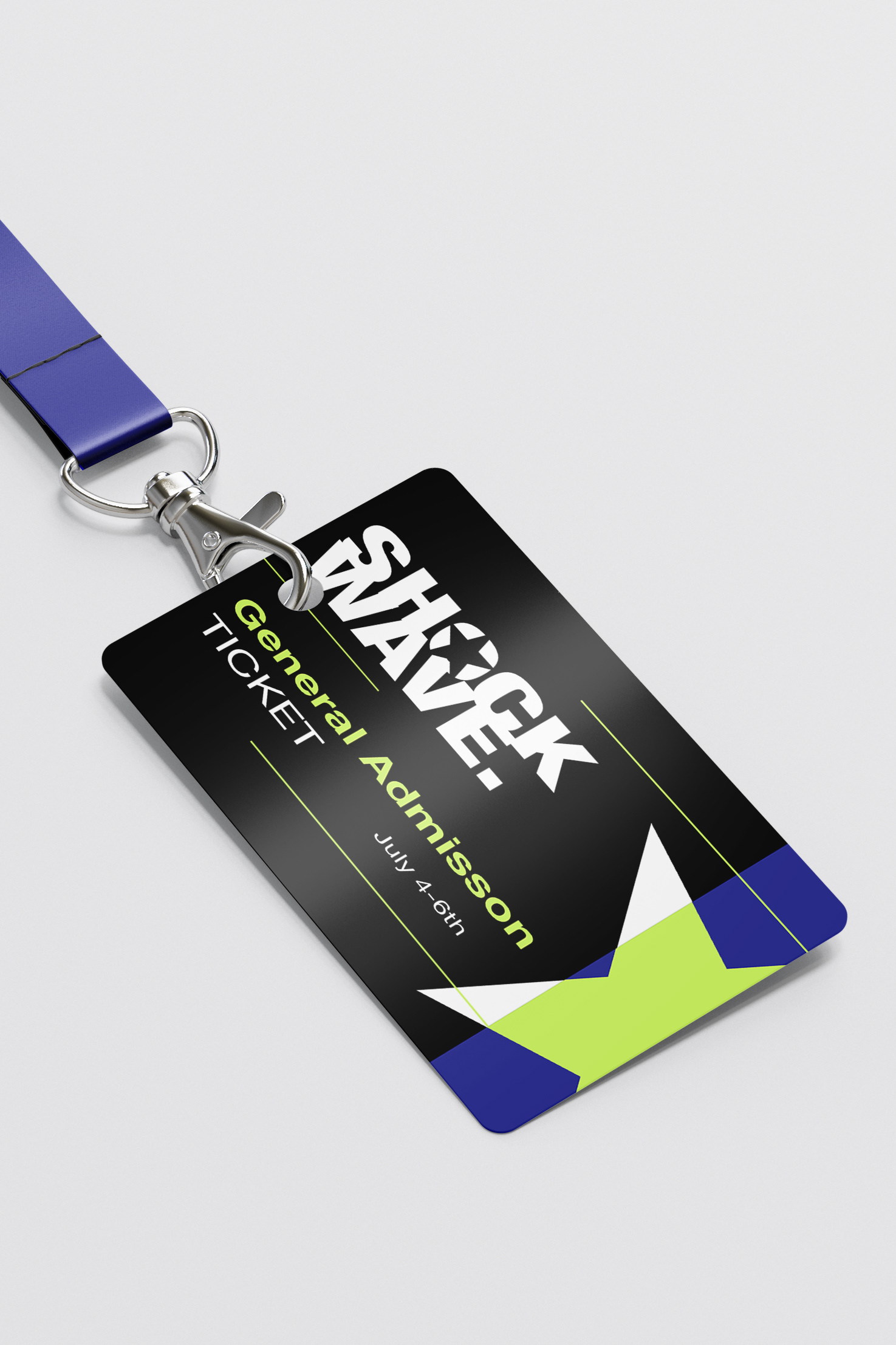
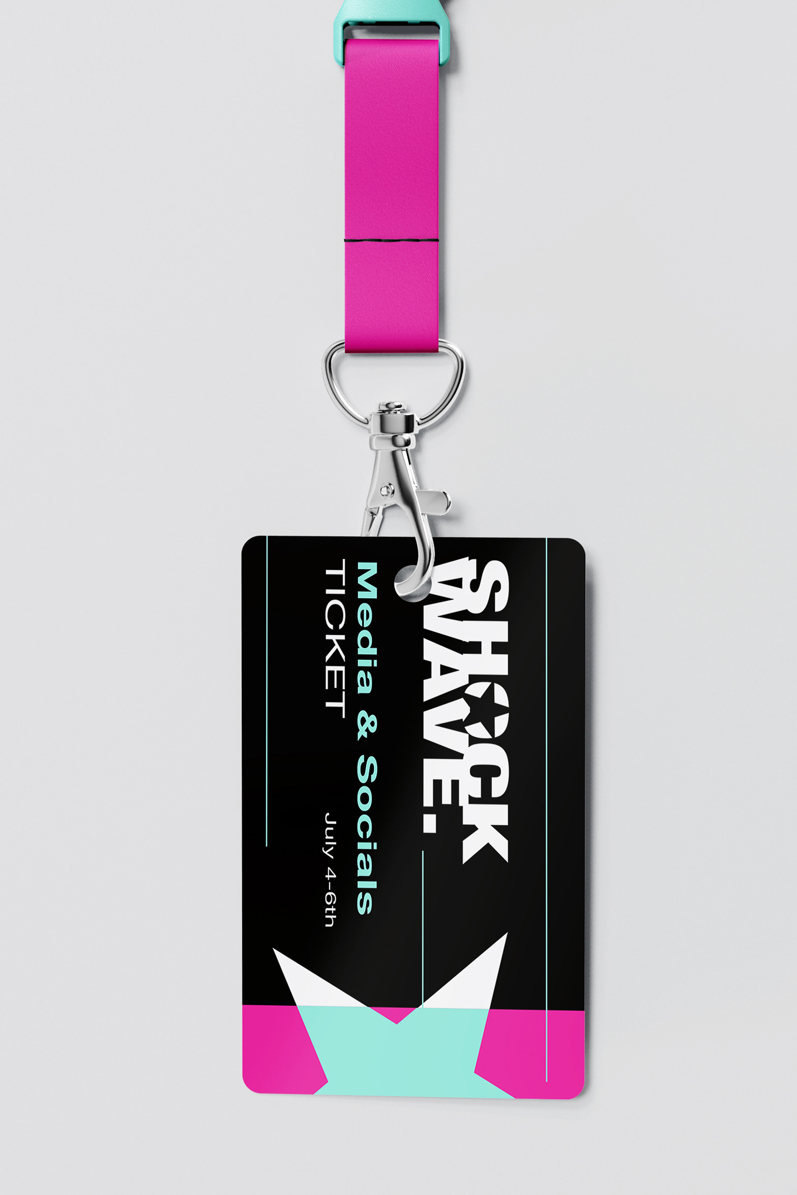
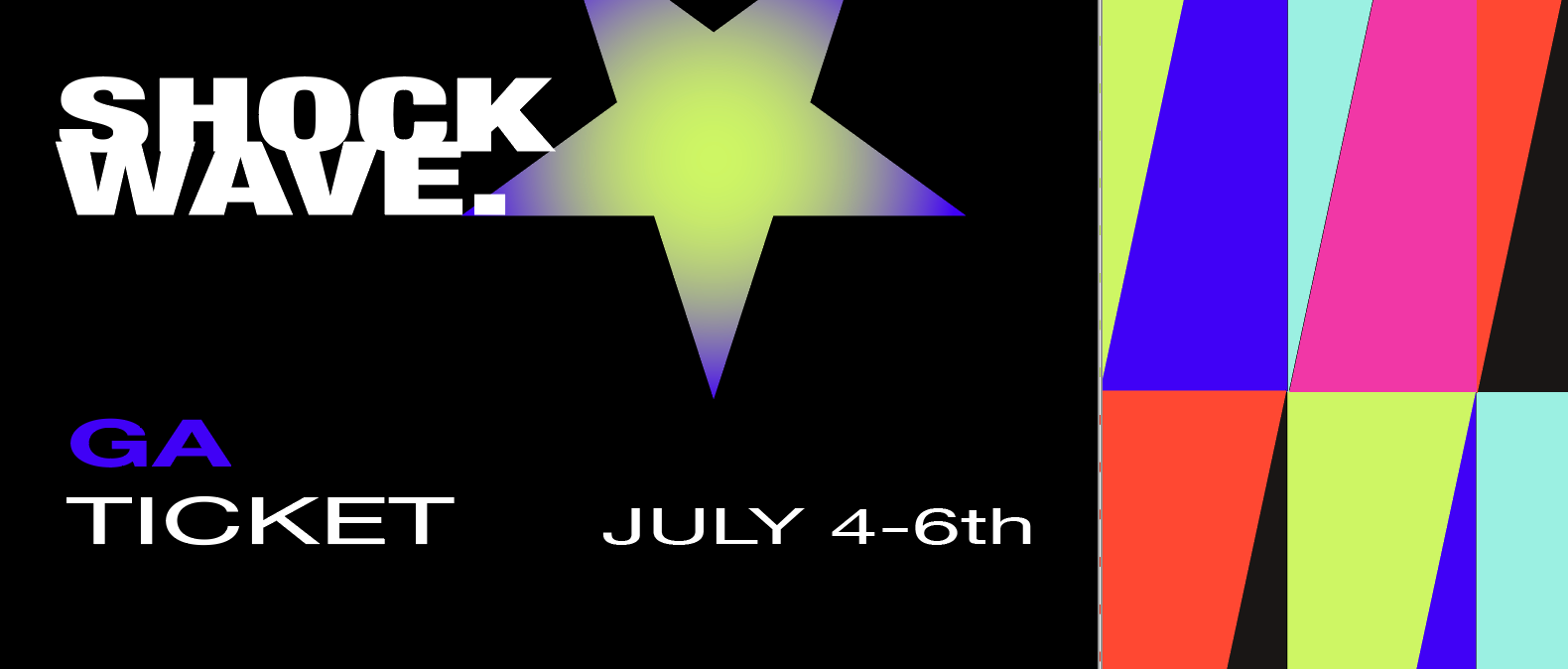
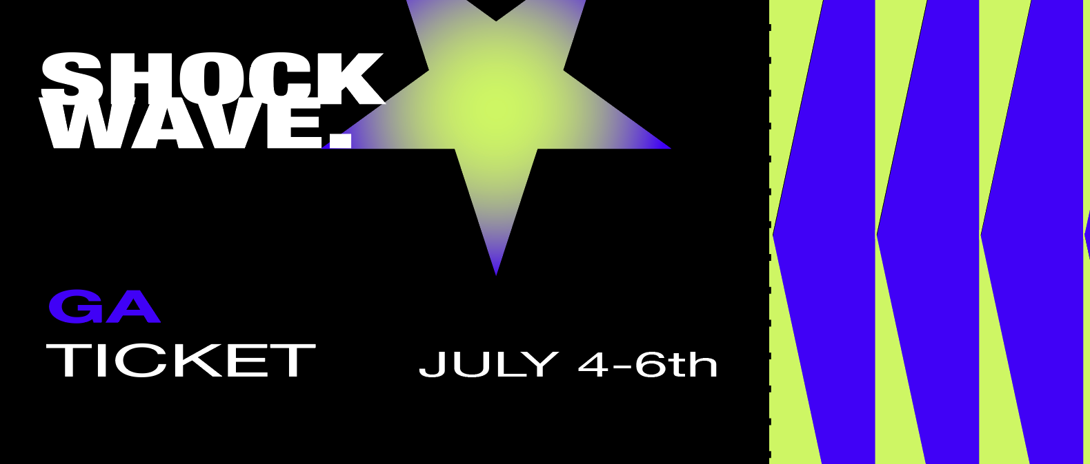
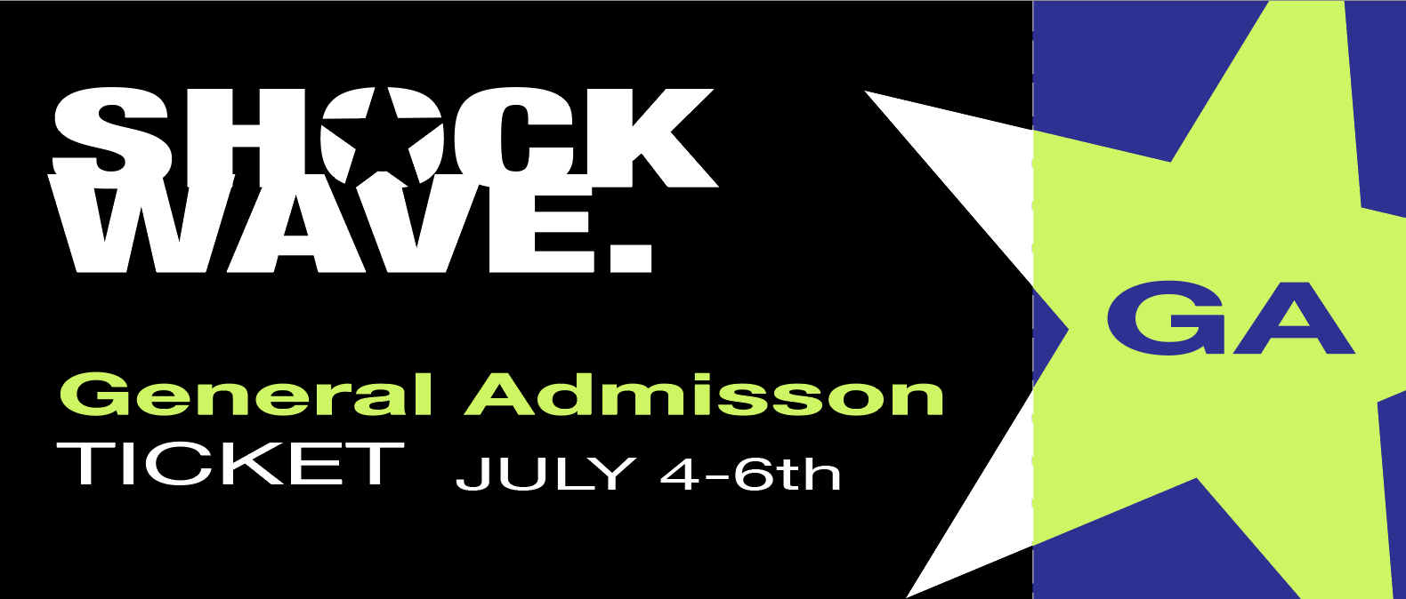
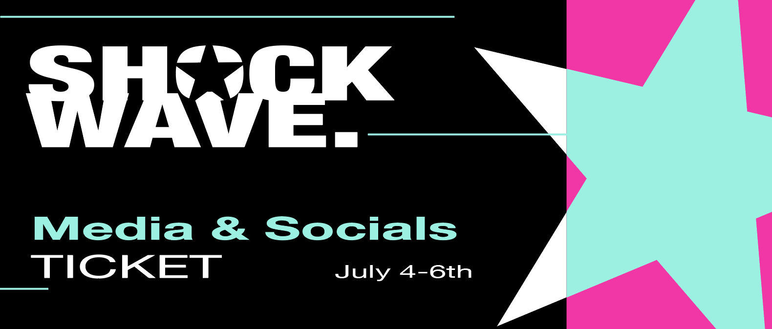
scannable badges
The scannable lanyard badges are reusable tickets designed to complement the poster series but still feel standalone. The three different types include general admission, social media, and exclusive tickets.
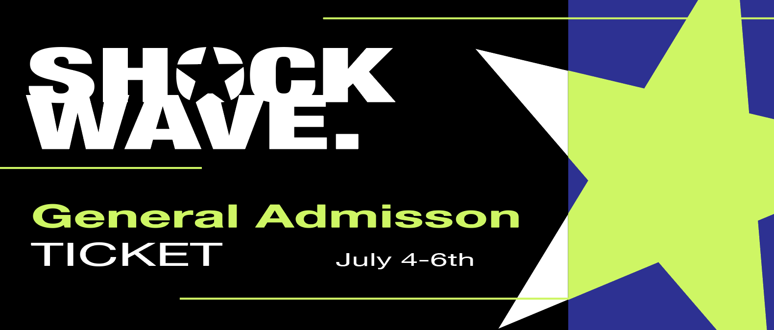
Final badge designs


final design deliverables