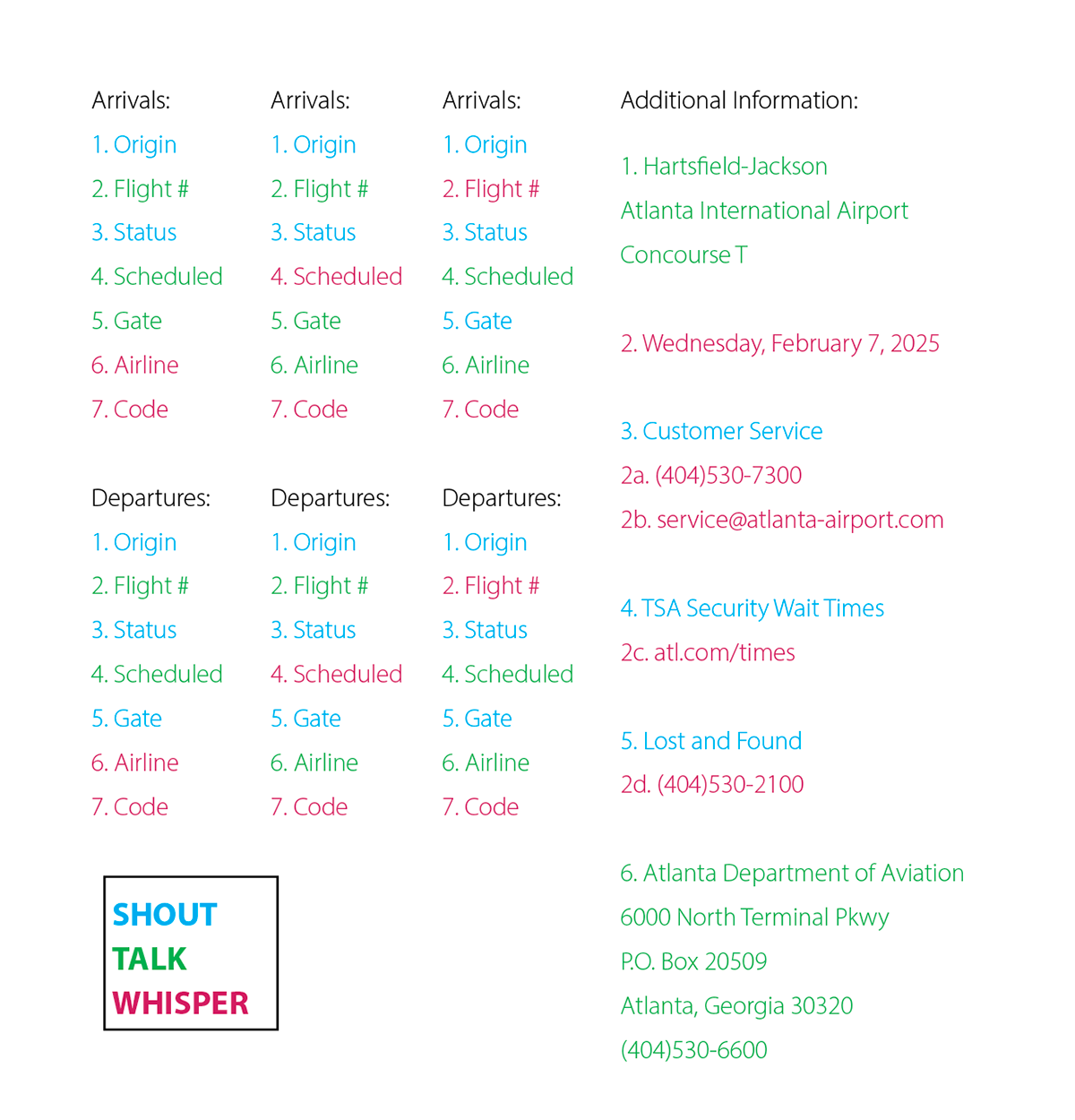
Hierarchy Studies
With the provided information, I explored different chunks of text based on what I felt was more important. Then cycling through multiple structure variations.
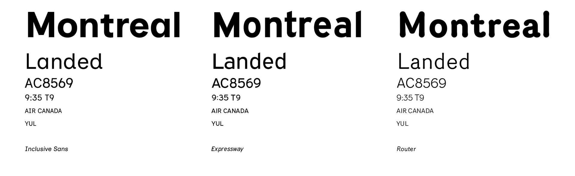
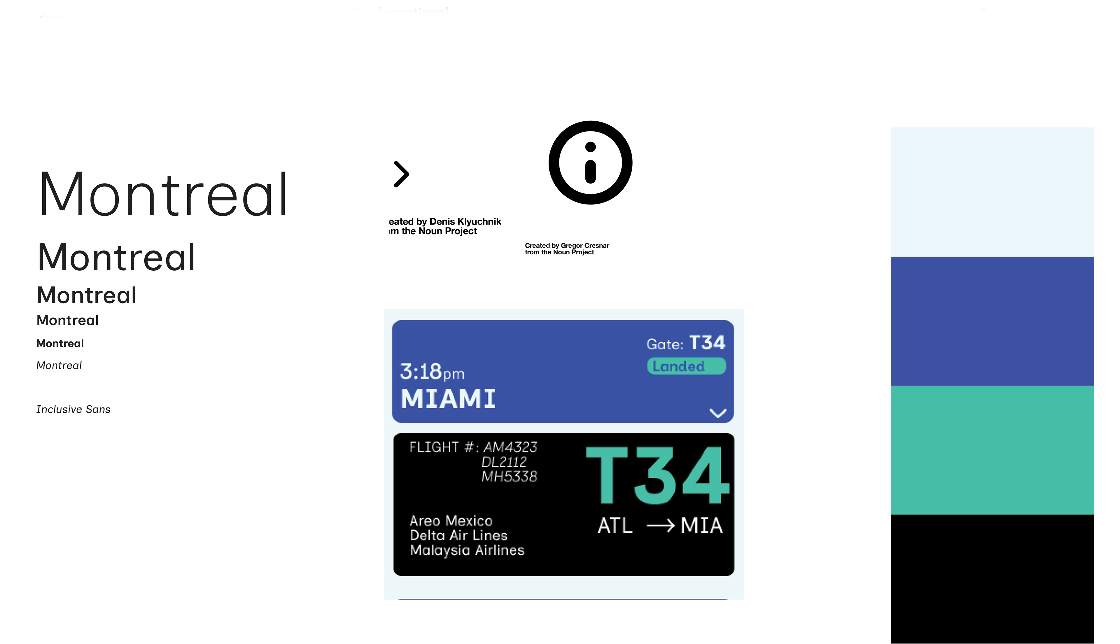
Typeface Research
I evaluated several typefaces that were all designed to communicate information in a friendly and clear manner, in alignment with the needs of my target audience. Among them, I found that Inclusive Sans offered the best balance of readability, variety, and approachability.
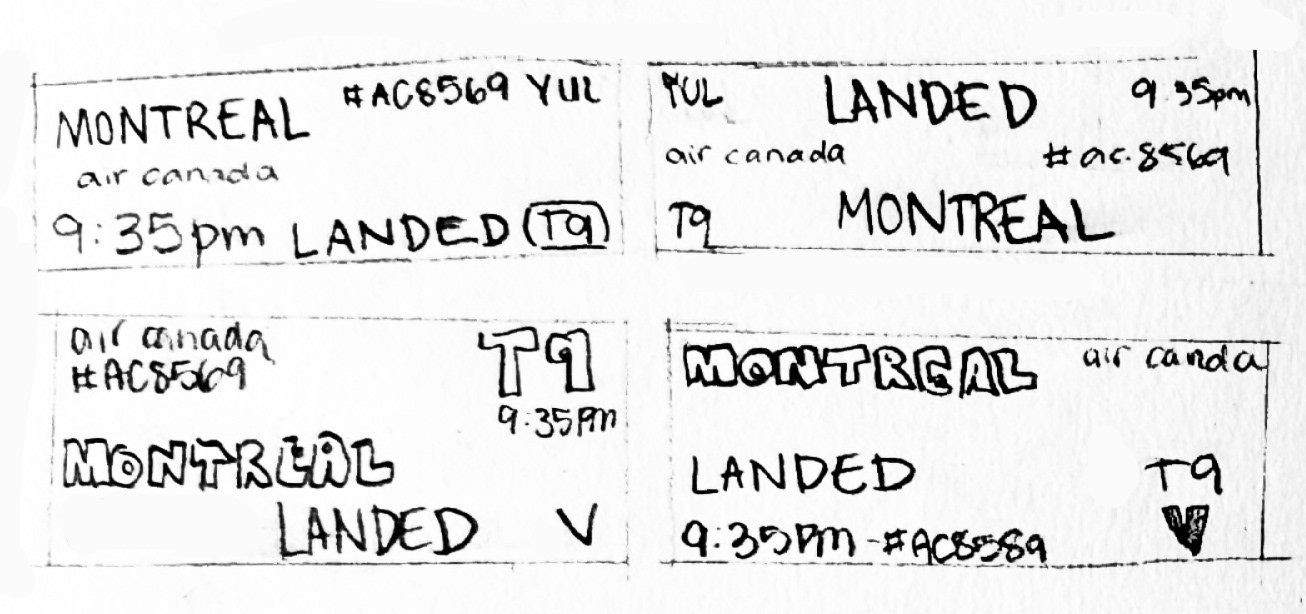
Interface Sketching
To identify what I needed in my interface parts and whole, I sketched out early-stage layout explorations.
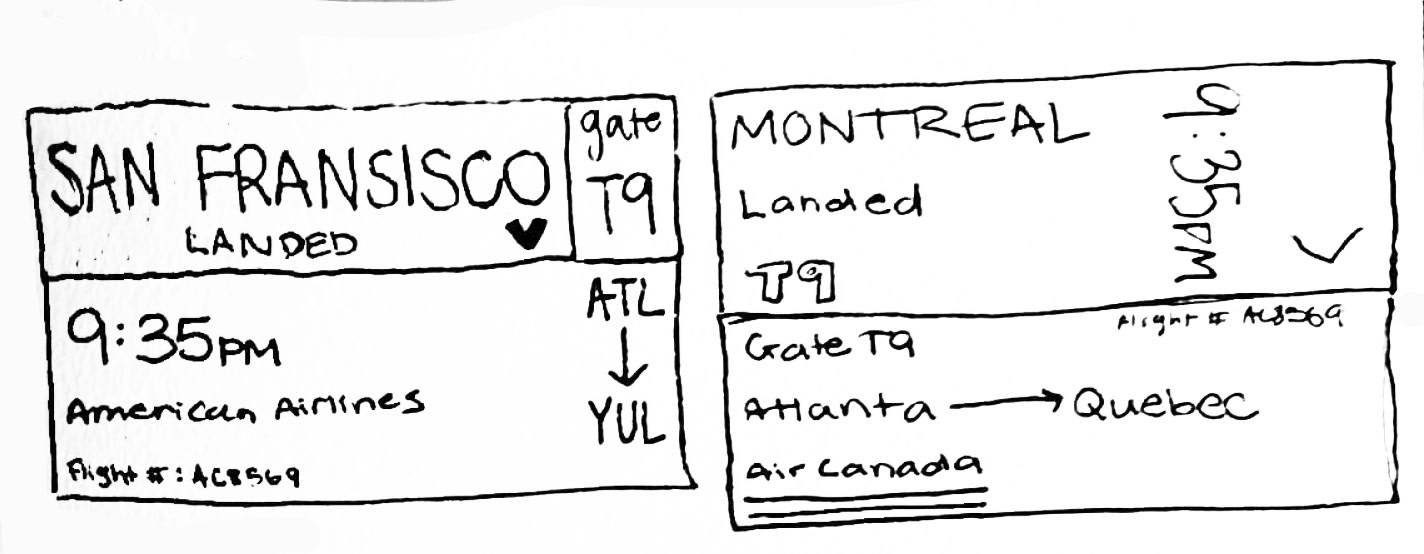
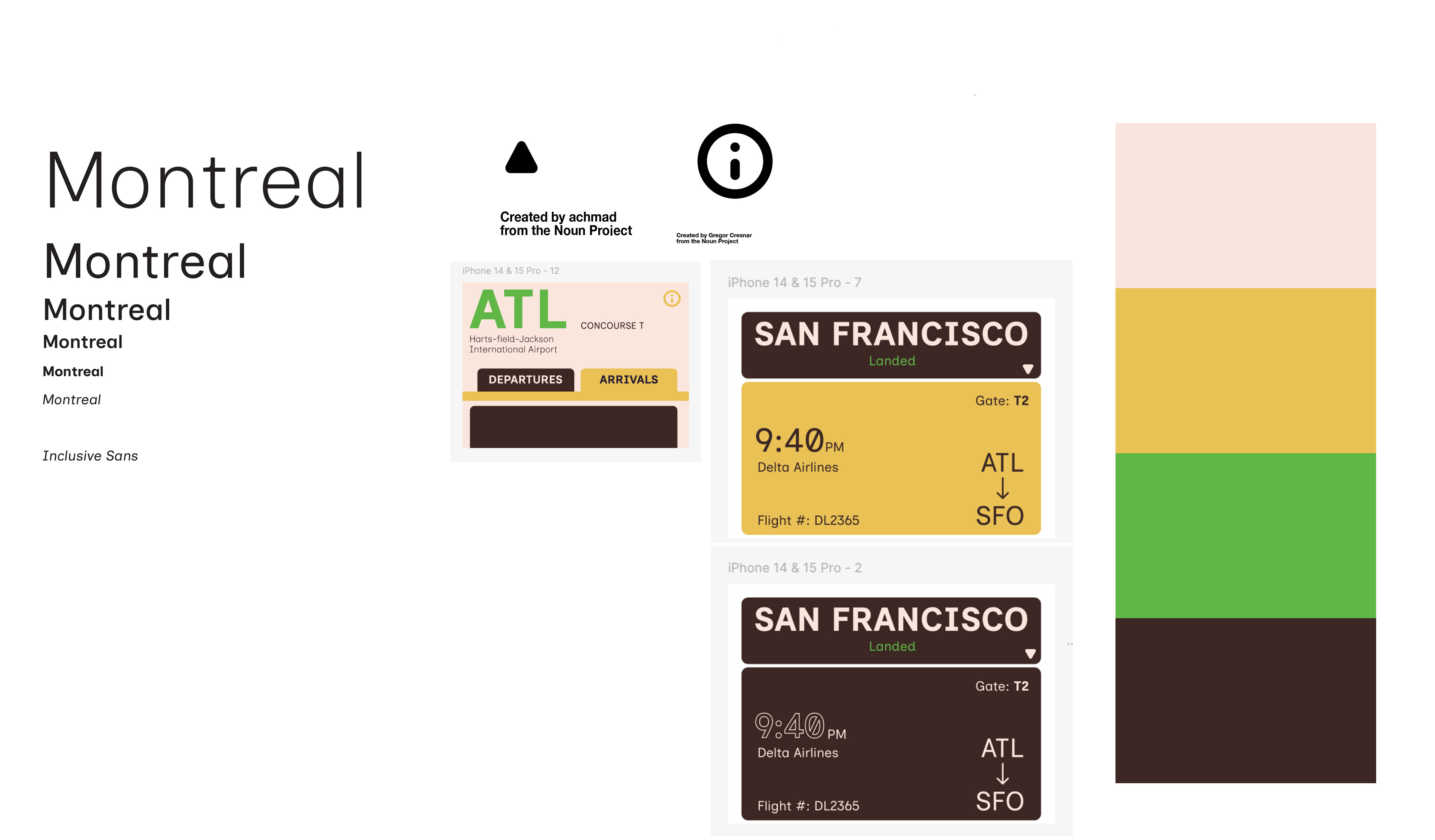
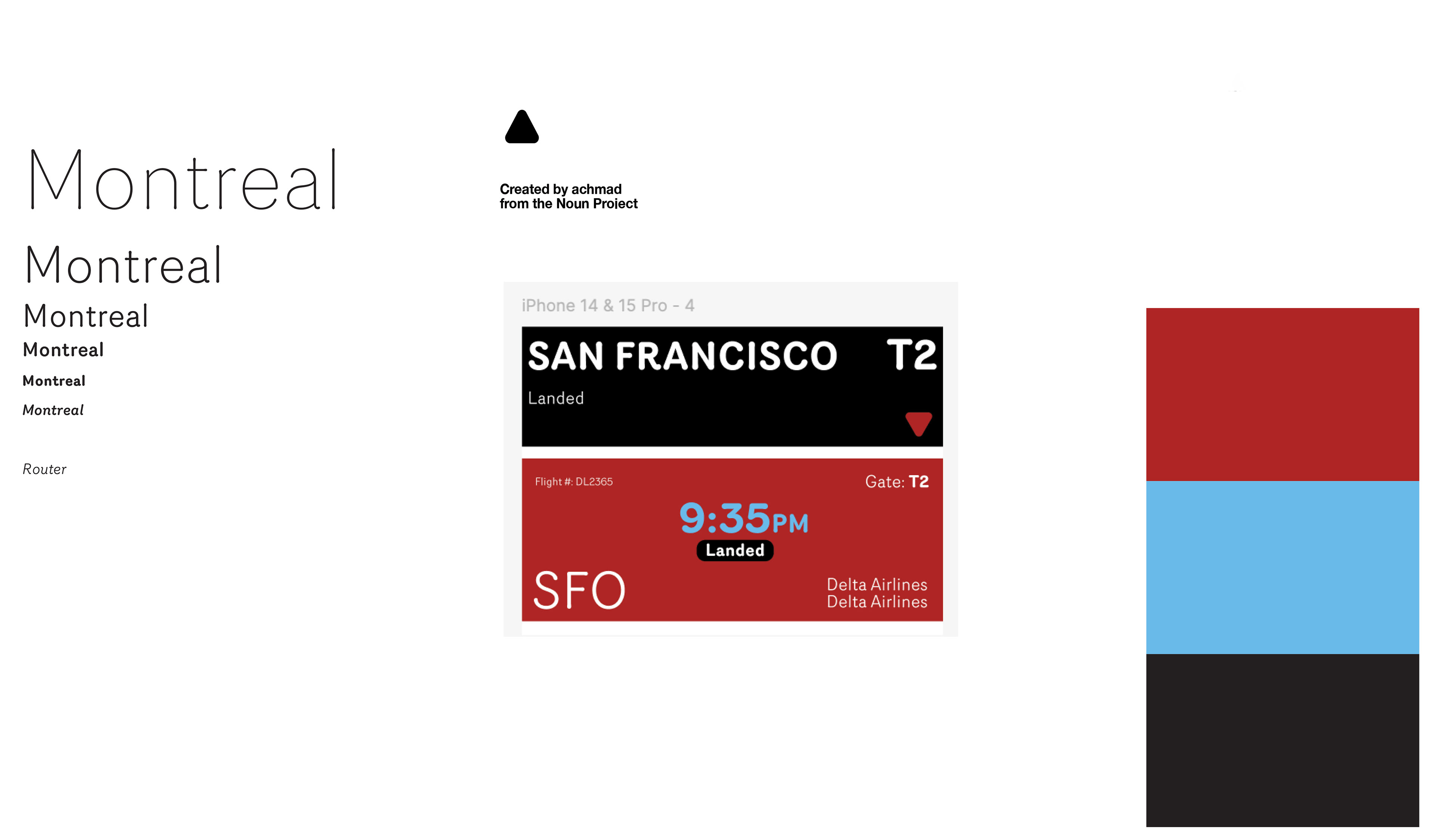
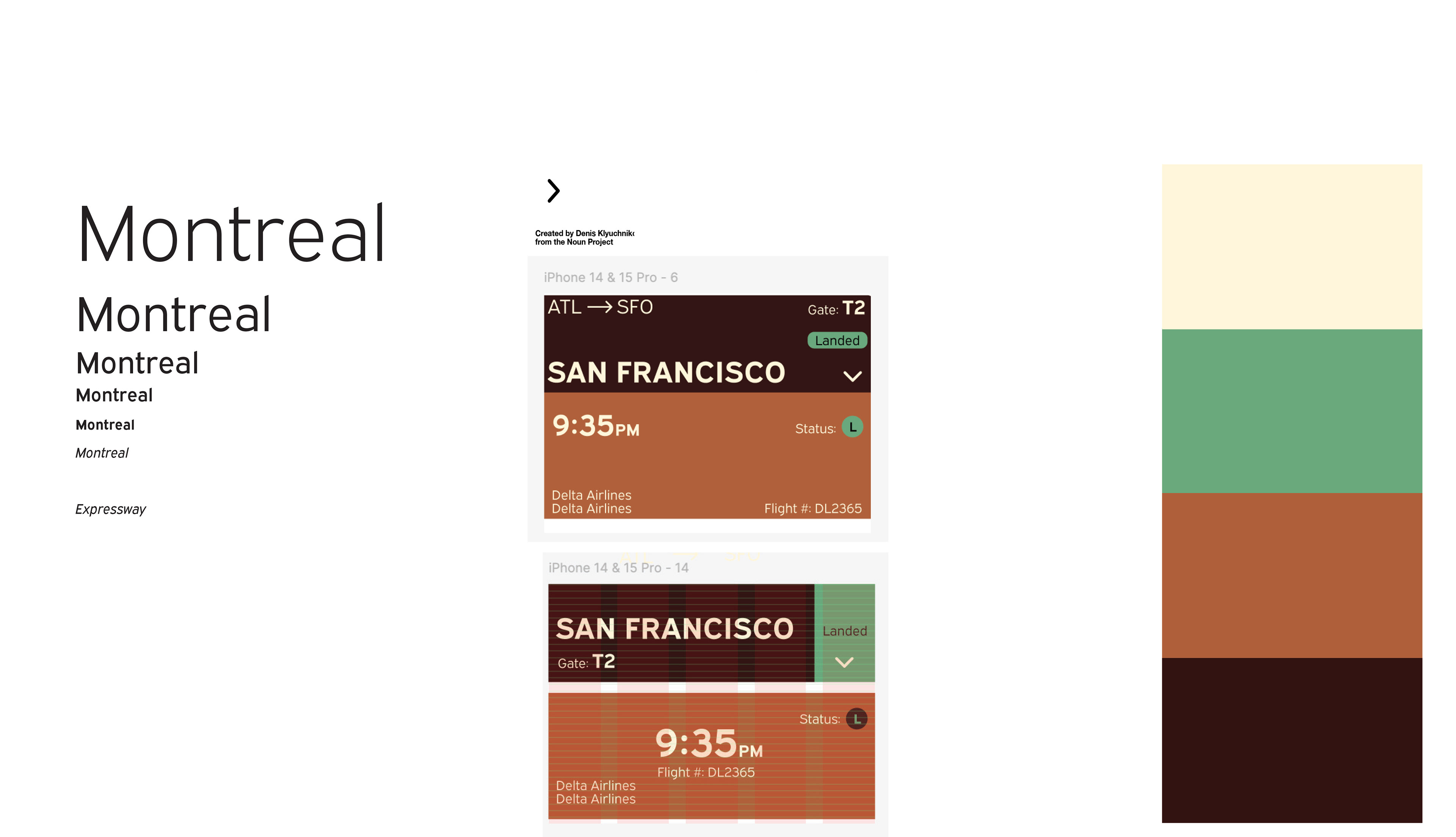
I then paired different interface parts with varying colors and typefaces in order to distinguish 4 distinct systems.
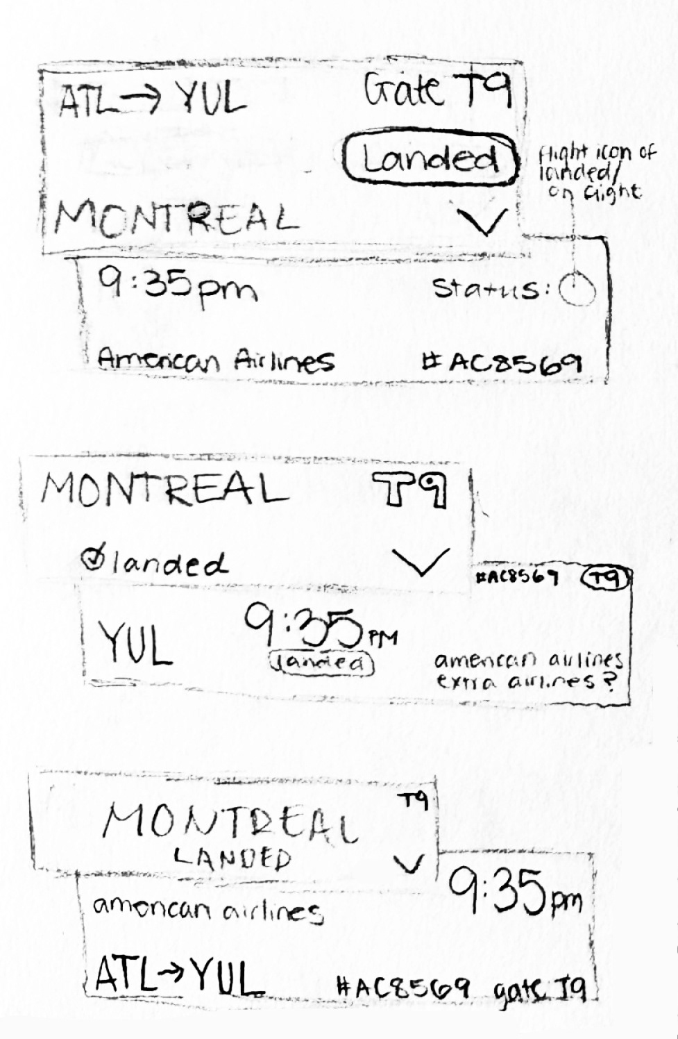
Ideation and Iteration of Interface
Making small changes and moving further with the directions that were working best, I continued iterating on my systems.
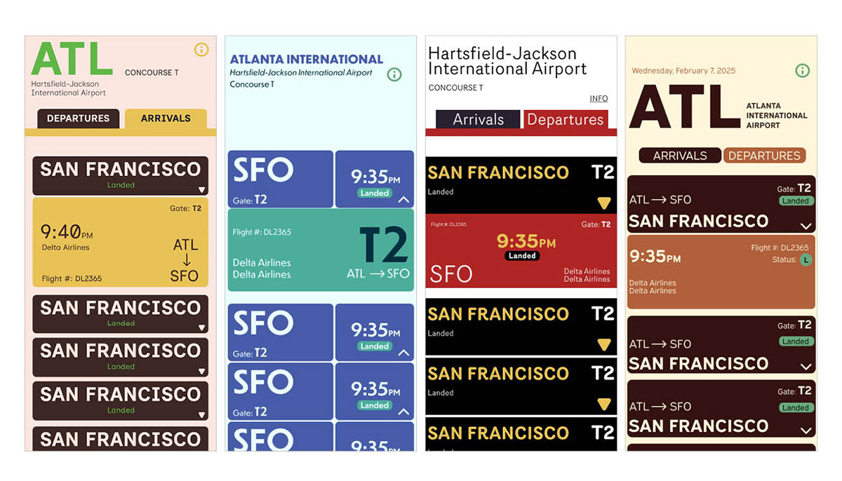
Once choosing a system I worked to refine my interface and began possible changes towards a final direction.
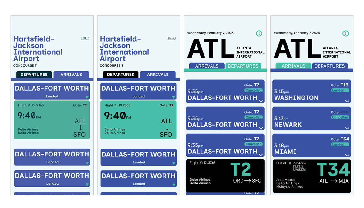
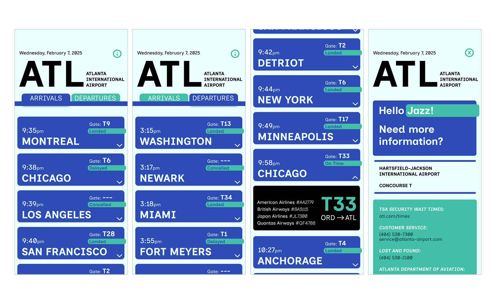
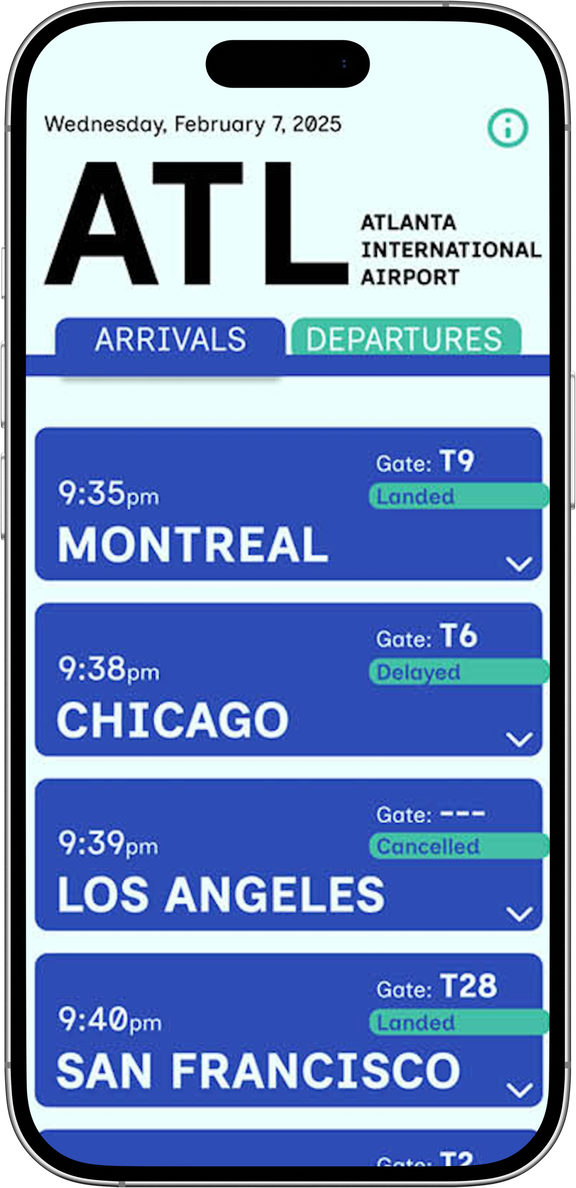
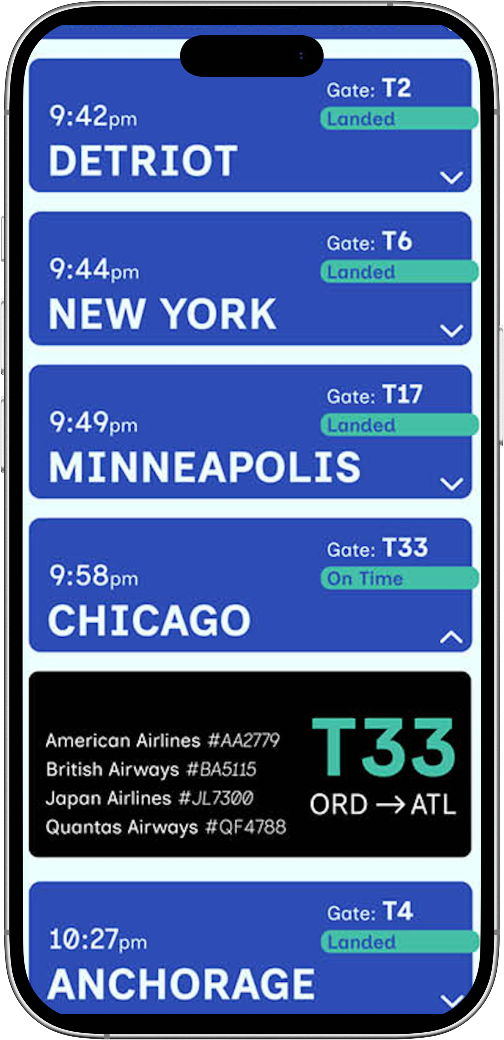
Final Results and Prototype
After more refinement and critique, in order to make my app more approachable and easier to use with a visual of a drop-down, including the buttons for every drop-down and closed flight option I created my final screens below.